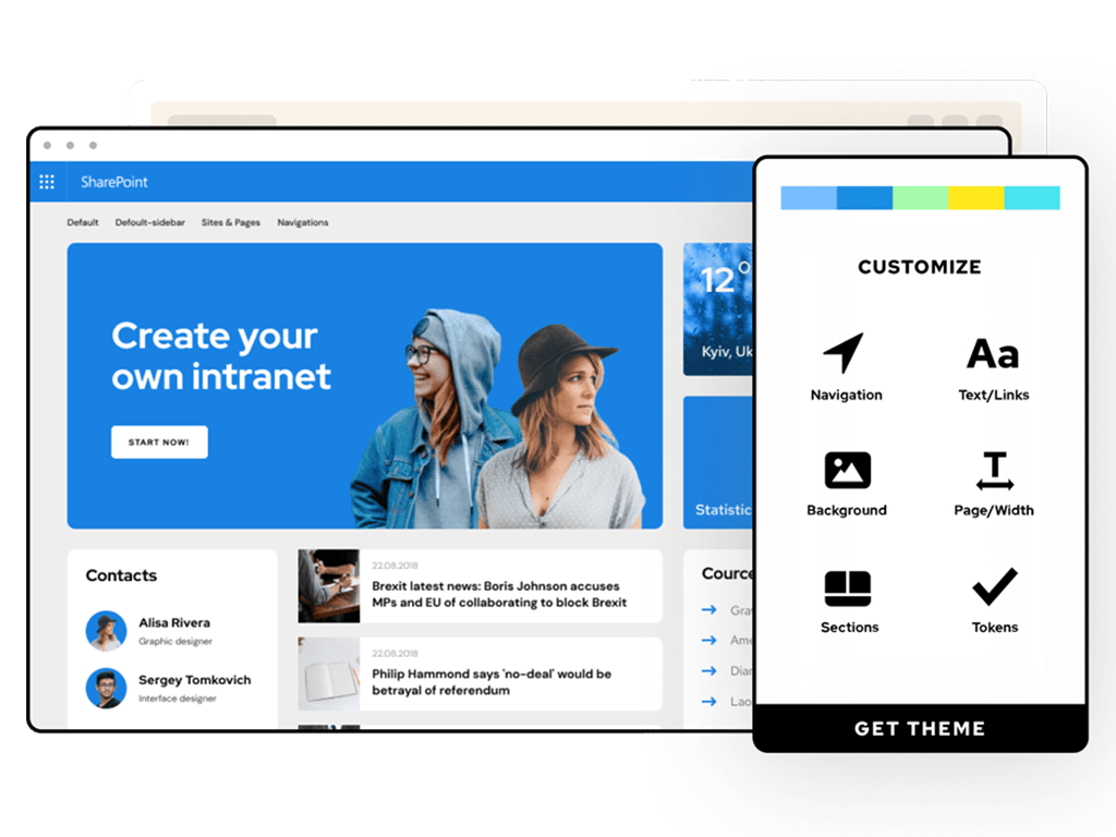
Design a beautifully branded intranet.
Create a unique and personalized intranet that mirrors your brand identity.

Design branded workspaces

SPC

Metro

Terra

WePro

Flexo

Zeus

SPC

Metro

Terra

WePro

Flexo

Zeus
Powerful design capabilities
Corporate Identity
Create an intranet that reflects your company's culture and identity, converting employees into brand advocats.
Corporate Identity
Create an intranet that reflects your company's culture and identity, converting employees into brand advocats.
20+ Themes Gallery
The only provider with a gallery of base designs from which to choose, addressing your most demanding design requirements.
20+ Themes Gallery
The only provider with a gallery of base designs from which to choose, addressing your most demanding design requirements.
Define your Brand Kit
Define colors and fonts to create a consistent corporate brand. Customize once and reuse across all your sites.
Define your Brand Kit
Define colors and fonts to create a consistent corporate brand. Customize once and reuse across all your sites.
Custom Fonts
Over 900 fonts available for quick use, or the ability to upload your own for a 100% brand match.
Custom Fonts
Over 900 fonts available for quick use, or the ability to upload your own for a 100% brand match.
Rich Backgrounds
Liven up your designs by applying color, images or gradients to your backgrounds.
Rich Backgrounds
Liven up your designs by applying color, images or gradients to your backgrounds.
Hide/show elements
Easily toggle the visibility of page elements, like sidebar, footer or breadcrumbs, for optimal screen real estate usage.
Hide/show elements
Easily toggle the visibility of page elements, like sidebar, footer or breadcrumbs, for optimal screen real estate usage.
Organize Assets
Easily organize your own images, fonts and customizations, ready to be re-used when configuring a new theme.
Organize Assets
Easily organize your own images, fonts and customizations, ready to be re-used when configuring a new theme.
Design Team
Share your designs with your teammates for a truly collaborative design process.
Design Team
Share your designs with your teammates for a truly collaborative design process.
Theme capabilities
In-page editing panel
Go beyond out-of-the-box SharePoint with our in-page editing panel. Exclusive to BindTuning themes.
In-page editing panel
Go beyond out-of-the-box SharePoint with our in-page editing panel. Exclusive to BindTuning themes.
HTML in content areas
Ensure detailed control over final page structure with the ability to add HTML code to any content area.
HTML in content areas
Ensure detailed control over final page structure with the ability to add HTML code to any content area.
Custom Code
Add custom CSS/JS to pages, even in modern SharePoint. Deep level of control, for your most demanding requirements.
Custom Code
Add custom CSS/JS to pages, even in modern SharePoint. Deep level of control, for your most demanding requirements.
Pro Navigation
Unparalleled control over navigation, supporting multiple sources (global, current, termset), also inheriting from different sites.
Pro Navigation
Unparalleled control over navigation, supporting multiple sources (global, current, termset), also inheriting from different sites.
Extended Menu Design
Professional control over navigation design, not only with powerful mega menus, but also with detailed settings for animations and accessibility.
Extended Menu Design
Professional control over navigation design, not only with powerful mega menus, but also with detailed settings for animations and accessibility.
Compact Mode
Get some extra screen room with compact mode. Screen real estate is precious when productivity is a concern.
Compact Mode
Get some extra screen room with compact mode. Screen real estate is precious when productivity is a concern.
Extended Search
Have multiple sites use the same settings, backup settings and content, propagate content and settings to other sites.
Extended Search
Have multiple sites use the same settings, backup settings and content, propagate content and settings to other sites.
Mobile-ready
All BindTuning themes are fully responsive and ready for mobile, for optimal usage of SharePoint & Office 365 sites on any device.
Mobile-ready
All BindTuning themes are fully responsive and ready for mobile, for optimal usage of SharePoint & Office 365 sites on any device.
Intranet
Design is part of one Intranet Subscription along with Build, Accessibility and Teams. Get unlimited branding and customization using ALL of the designs in our Themes Gallery.
Endless possibilities for
enterprise workspaces.
Let us show you the possibilities for your
organization with BindTuning.


