A little bit like in fashion, web design is more and more dependent on trends. Trends come and go, and some stick around for years, when they greatly improve user experience. My 2 last speaking engagements were about "Web Design Trends", so I decided to share what I believe best resumes the top 15 trends this year.
#1 Fonts with personality
Gone are the days when designers had a handful of system fonts available for all their web site designs. From Arial to Georgia or Verdana, we were very limited, mostly selecting from serif or non-serif types.
A lot has changed in the past decade.
Techniques like sIFR (2005) or Cufón (2008) were used along the way but performance limited their usage to some titles or small blocks of text.
Although planned and specified many years before, CSS3 web fonts became widely used in the last 3 years. But now, more than ever, it's great to see web designers experimenting with new, different and bold types of font.
One trend you can expect to see this year are fonts with personality, fonts which can "speak" for themselves creating unique designs, even more, transmitting emotions and feelings like tradition, respectability, modern, clean, chic, elegance, amusement...
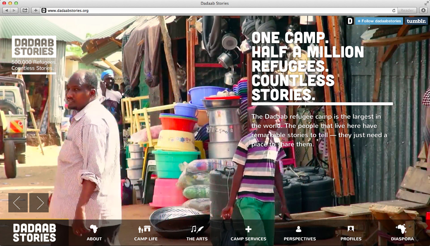
This trend has grown to include font-based icons, where icons are displayed in a page like text. Dozens of amazing icon fonts are available empowering designers with a multitude of choices.
Inspiration
http://stuffandnonsense.co.uk
http://www.dadaabstories.org
http://pulpfingers.com
http://www.kccreepfest.com
Web Font tools
http://www.google.com/fonts
http://www.fontsquirrel.com
Icon Font tools
http://fortawesome.github.io/Font-Awesome
http://fontello.com
#2 Flat Design
Back in 2012 Skeuomorphism was the word. Beautifully crafted 3D website designs simulated real life experiences, with elements like textured backgrounds, engraved letterings, stitched borders, ribbons, glossy buttons and other elements populating web pages.
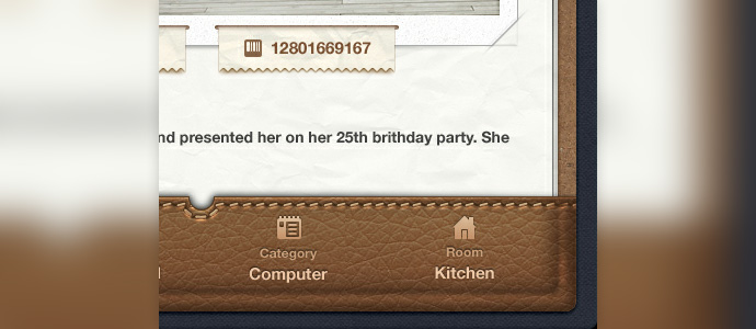
See 50 examples of skeuomorphic design
But in middle 2012 Microsoft "changed the game", introducing its new Windows Design, initially called "Metro Design", based on clean design concepts like clean typography, usage of empty space, flat illustrations and no use of real-life "metaphors". Flat design was in.
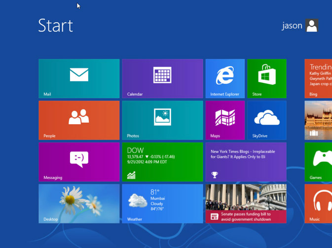
With the release of iOS7 Apple followed this trend, by dropping pretty much any skeuomorphic design element it could. Quickly this trend passed on to websites, and this is one of the strongest trends today.
Benefits of flat design
Usage of flat design proved to have several benefits, including:
- Easy to use
No need to create complex illustrations or 3D graphics - Perceived as honest
Flat design is assumed to be digital, not "faking" to be the real world - Efficient
CSS and other resource files are considerably smaller. More efficient in responsive websites - Faster loading times
For the same reasons previously mentioned - Trendy
Yes, flat is the talk of the town, clean sharp visual elements are a must these days.
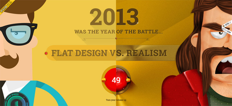
Check out this mind-blowing website about flat vs. realism
Inspiration
http://www.fostr.com
http://landerapp.com
http://www.conjure.io
http://davidhellmann.com
http://jeet.gs
https://www.hioscar.com
http://www.housekitchen.fr
#3 Huge hero units
If you asked me what the #1 trend in Web design today is, this would be it.
Hero areas are quickly taking over real estate on websites, quickly replacing sliders as the new attention-grabbers, and they are becoming increasingly more creative and elaborate.
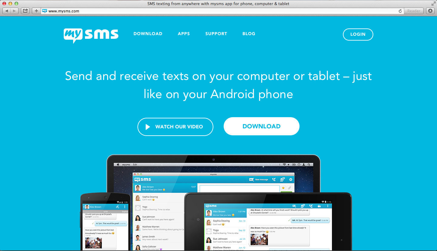
Content varies depending on the purpose of the website, from videos, to huge search areas, including relevant news or large carousels. The typical structure, however, includes a full-width image/video with a small amount of text, a strong tag line and a very compelling "call-to-action".
Inspiration
Animated:
http://mailchimp.com
http://realtii.com
http://www.bounceblock.com
http://tap.unicefusa.org
Slideshow:
http://ramotion.com
http://prezi.com
Video:
http://www.shopify.com
Static:
https://www.life360.com
http://www.mysms.com
#4 Videos ... not text
People have been glued to TV screens since the middle of the 20th century. Video on the web has had a similarly dramatic impact on the way content is consumed, resulting in YouTube becoming the web’s “second search engine”
It's a fact: if you're looking for the most effective form of engagement, choose video. Used on landing pages it will passively captivate users, and let them experience your message successfully.
On the other hand, videos are becoming easier to produce and easier to share. If you have a computer with a camera you can do it in a couple of hours.
Why use video?
There are several reasons to justify the usage of videos on landing pages:
- Passive engagement
Users can just "sit and relax" while they absorb your message - Increase conversion rate by 80%
Studies show that using video on landing pages can increase conversion by 80% - More time on your website
Users will stay longer on your website when watching a video, giving your brand more exposure - Increased trust factor
And if your employees, company or customers are featured during the video, trust in your brand will significantly increase - Users prefer to watch
Let's face it, we all prefer watching rather than reading
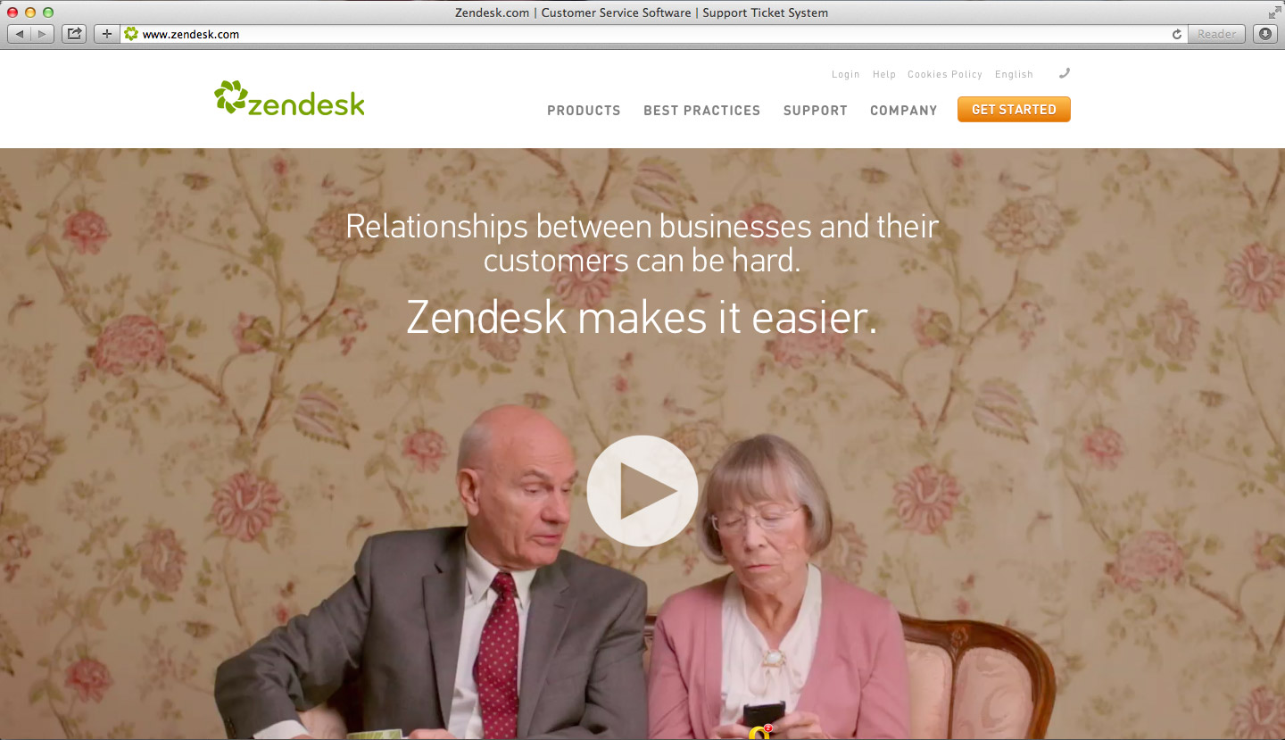
Brands are using videos on landing pages using various approaches, from background video, to full-screen players, depending on the goal. If videos are short or used on the background, typically auto-play is on, but when videos are longer it's probably a good idea to add a play button. Also make sure to add a call-to-action along with your video. Users will most likely click it!
Inspiration
http://www.zendesk.com
http://enlivenhq.com
http://setseed.com
http://www.fiftythree.com
http://whiteboard.is
http://dreamtrip.adproagency.com/start
http://www.olympicstory.com
http://designmodo.com/startup
#5 Single page or long scroll websites
Another strong trend this year are single page websites, or long scrolling ones. This is a trend we have seen in the last couple of years, and in fact, if your website doesn't need a lot of content, the single page approach might be the best option - all content resides on the homepage and typically navigation will help users jump from one section to another.
Single page websites are not all that new. But if it was common to see long scrolling sites completely crowded with content, now these sites are much better organized, typically displaying a sequence of full-screen blocks, each with very little content and much easier to grasp.
When should I go this route?
- Tell a story
If you need a story-telling type of site, a single page is the perfect choice. You can "tell" your story while the users scrolls the page and provide compelling call to action elements along the way. Scrolling can be vertical or horizontal, check out the inspiration section below for both examples. - Reduced content
Websites with reduced content are also great candidates for single page layouts. Instead of breaking your content apart along many pages, create a compelling home page with nicely crafted content blocks and a simplified design, where the visitor can naturally progress along the page just by scrolling. - Mobile Apps
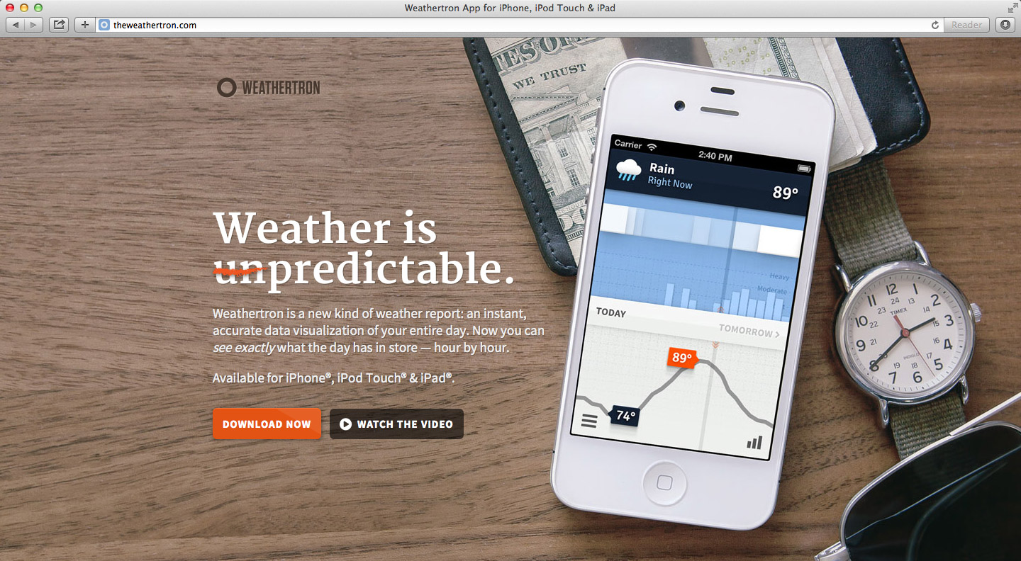
If you really think about it, the main purpose of a mobile app website is leading the user to download the app. For this reason typical app websites are really simple, some including only a download link!
Inspiration
Telling a story
http://trippeo.com
https://onlycoin.com
http://www.witcreative.info
Reduced content (section-to-section navigation)
https://www.chownow.com
http://electronicbrain.de
http://www.easymop.com.br
Mobile Apps
http://wipmessenger.com
http://theweathertron.com
http://human.co
https://venmo.com
http://turnplay.ramotion.com/en
http://www.everest.com
http://retrica.co
This is the first part of three articles which will in total explain the top 15 web design trends for 2014. Part 2 soon to be available!


