


Responsive design is a very popular topic nowadays, and currently most designers are adopting this new concept in web design. A responsive layout includes both flexible grids and images able to adapt to the screen’s width. But what about typography? Shouldn’t font size automatically adjust to different devices and resolutions too? This article aims to show how to achieve fluid type, making your site even more flexible.
Using media queries
One way is to adopt an adaptive approach, setting breakpoints depending on the device width using media queries. For example, setting font size headings to 18px for 480 pixels layouts, and 32px to a range width of 980 pixels.
@media (max-width: 480px)
{
  h1 { font-size: 18px; }
}

@media (min-width: 980px)
{
  h1 { font-size: 32px; }
}
This option works well if your website is mainly text. But when other kind of content like images and video come into play, and we want to take advantage of multi-column layouts, a fully flexible always take brighter results.
Browser width and typographic length should be proportional in some responsive elements. When using a smaller device, there is less space available for content and fewer words hold in a single line.
Responsive viewport units for fully fluid type
CSS3 introduced some new kind of typographic units: viewport sized typography.
Viewport-percentage units are:
| UNIT | DESCRIPTION |
| vw | stands for viewport width |
| vh | stands for viewport height |
| vmin | equal to the smaller of ‘vw’ or ‘vh’ |
| vmax | equal to the larger of ‘vw’ or ‘vh’ |
How do viewport-percentage units work? W3C
Viewport-percentage lengths are relative to the size of the initial containing block, i.e., the container element of the text. When the height or width of the initial containing block is changed, they are scaled accordingly.
Similar results with percentages or em units are achievable, but what makes these so promising is they eliminate the dependency on parent elements and instead allow sizing purely based on the viewport size.
The vw unit (viewport width) is equal to 1/100th or 1% of the width of the viewport. In the example below, if the width of the viewport is 1000px, the font size of the h1 will be 40px.
h1 { font-size: 4vw; }
Doing some math, it’s clear how it works: 4×1000/100 = 40
Shrinking the browser window to 480px wide, the width of the element would resize with it to 19px wide (4x480/100 = 19.2).
Browser support
Currently, these units are only fully supported in Chrome 26+, Firefox11+ and Opera15. To follow-up the evolution of this units, visit this site.
Plugins:
FitText
FitText is a jQuery plugin that inflates type to fill its container, creating a similar effect to using viewport-percentage units. No matter what the window size, text will go full width. It is more commonly used on headings, but it can be used through any text element of your DOM.
FitText is one utility that’s grown in popularity, making flexible display type much more accessible.
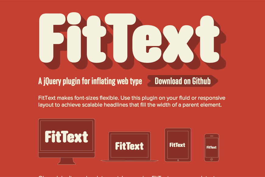
View FitText source code | Visit FitText demo site
How to use
FitText is a JavaScript file that can be added to your js website folder. In your html file include calls to jQuery and jquery.fittext.js file.
Set up the fitText function to apply to selected elements (h1 and h2 in the following example) and you’re done.
<script type="text/javascript"
  src="http://ajax.googleapis.com/ajax/libs/jquery/1/jquery.min.js">
</script>
<script type="text/javascript" src="js/jquery.fittext.js"></script>
<script type="text/javascript">
  $("h1").fitText();
  $("h2").fitText();
</script>
Configurable options
There are some options available in case we want the resize effect to be abrupt or softer – by adjusting the compressor:
$("h1").fitText(1.2); // resizes more aggressively
$("h2").fitText(0.8); // resizes less aggressively
We can also set a font-size range to limit the element’s resizing:
$("h1").fitText(1.2, {minFontSize:'16px', maxFontSize:'32px'});
The above means that our heading will be displayed at least at 16px – on smaller devices, and it’ll plump until 32px, which is the font-size displayed on bigger desktops.
Here is a quick and simple example:
<div class="container">
<header>
<h1>FitText Heading</h1>
<h2>Full width text has never been so easy!</h2>
</header>
<p>Lorem ipsum dolor sit amet, consectetur adipisicing elit, sed do eiusmod tempor incididunt ut labore et dolore magna aliqua. Ut enim ad minim veniam, quis nostrud exercitation ullamco laboris nisi ut aliquip ex ea commodo consequat.Duis aute irure dolor in reprehenderit in voluptate velit esse cillum dolore eu fugiat nulla pariatur. Excepteur sint occaecat cupidatat non proident, sunt in culpa qui officia deserunt mollit anim id est laborum.</p>
</div>
<script type="text/javascript">
$("h1").fitText(1.2);
$("h2").fitText(1.5);
$("p").fitText(1.0, { minFontSize: '12px', maxFontSize: '16px' });
</script>
Container was set to 80% width and any font size was defined to those three text elements.
I decided to set a maximum value of 16px to the paragraph, as I don’t want it get big as headings. Using a higher compressor value results in a smaller font-size. As smaller compressor value is applied, the bigger the resulting font-size value.
The final result:

The algorithm behind
FitTex does on the fly font-size calculation. Uses the width of the element and a configurable JavaScript argument (the compressor) to scale text down to smaller widths - items are resized based on their width divided by the compressor value * 10. In case maxFontsize and minFontSize variables are set, the font will never be resized over and above those values, respectively.
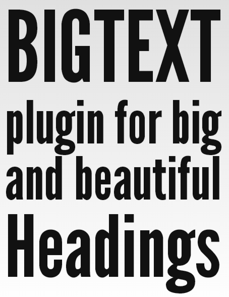
BigText
The BigText jQuery plugin automatically sizes text to fit inside its parent element. BigText is similar to FitText in that it scales text to fit a certain width. The difference between both plugins is that BigText is used to achieve vertical alignment of multiple lines of text. This plugin also works in editable text areas. So that the font resizes as the user types his text.
View BigText source code | Visit BigText demo site
How to use
The BigText jQuery plugin takes a single element and sizes the text inside of its child div's to fit the width of the parent element, as we can see in this example:
<div id="bigtext" style="width: 300px;">
<div>BIGTEXT</div>
<div>plugin for big</div>
<div>and beautiful</div>
<div>Headings</div>
</div>
Now, apply the BigText function - call jQuery and BigText script file is also needed.
$('#bigtext').bigtext();
The algorithm behind
Sizes text automatically from a base up to fit the element width, regardless of initial font size.
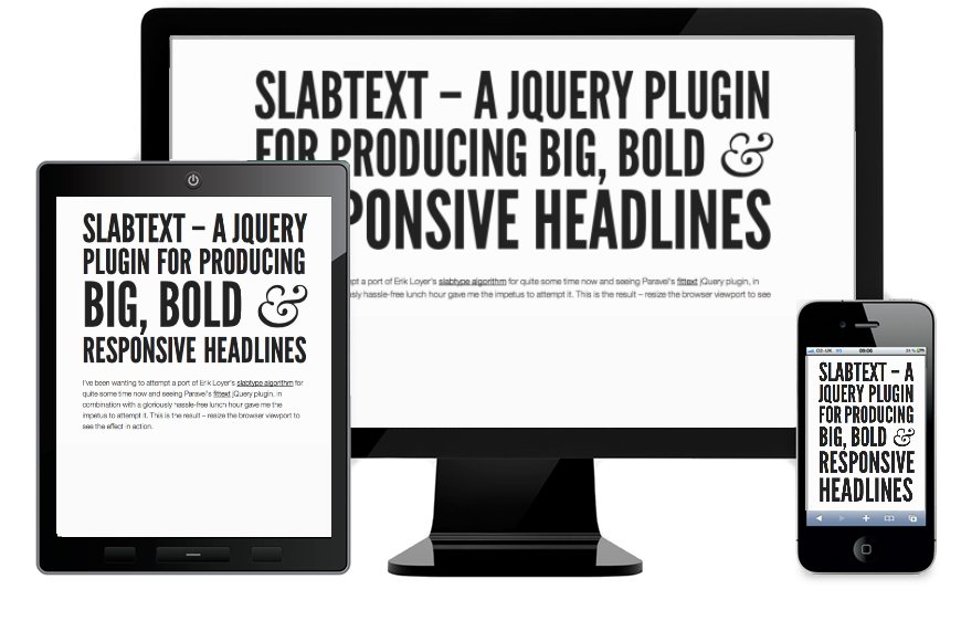
SlabText
Following closely along both option we saw before, SlabText makes it possible to easily create big, bold and 100% fluid headlines for responsive websites. SlabText might look similar to BigText, but there’s one important difference: BigText uses a constant number of lines while SlabText uses a variable number of lines. Taking a longer title marked h1, SlabText will split it in rows.
How to use
Set up SlabText function to h1 elements and prevent slabtext the headers if the viewport is under 320px:
<script type="text/javascript"
  src="http://ajax.googleapis.com/ajax/libs/jquery/1/jquery.min.js">
</script>
<script type="text/javascript" src="js/jquery.slabtext.min.js"></script>
<script type="text/javascript">
  function slabTextHeadlines() {
     $("h1").slabText({
       "viewportBreakpoint":320
     });
};
</script>
It's also possible to use Javascript to inject elements into the headline before calling the plugin, keeping the markup cleaner.
var stS = "<span class="slabtext">",
    stE = "</span>",
    txt = [
        "SLABTEXT - A JQUERY PLUGIN",
        "FOR PRODUCING BIG, ",
        "BOLD & RESPONSIVE HEADLINES"];

$("#myHeader").html(stS + txt.join(stE + stS) + stE).slabText();
The algorithm behind
SlabText script splits headlines into rows before resizing each row to fill the available horizontal space. The ideal number of characters to set on each row is calculated by dividing the available width by the pixel font-size – the script then uses this ideal character count to split the headline into word combinations that are displayed as separate rows of text.
Whatever the method that fits you, make sure you’re offering a pleasant reading. That’s the main point.