


By default SharePoint 2013 detects if the site is being displayed in a mobile device and shows the content in a very simplified portal that remove most of the features. Sometimes you just want more control over your mobile website.
Deactivating this view can be useful if you want to get the full site to be displayed on mobile devices, or if you have a custom responsive theme.
In this article I’ll show 3 different methods to change this behavior, and display the full website when in mobile devices.
Option #1 - Deactivate SharePoint Mobile feature
This is ideal if you are using Office 365 or if you don't have access to the SharePoint server. If you don't want to remove the mobile view from all sites this is the process you should follow.
- Open your site and go to Site Settings -> Manage site features
- Locate Mobile Browser View and click Deactivate
- Refresh your browser on your mobile device and you should see your entire SharePoint site

Option #2 - Change the redirect behavior of a mobile browser
This process is just available for the SharePoint 2013 on-premises, and you need to have access to the server where it is installed, you should follow this method if you want to remove the mobile view from all sites.
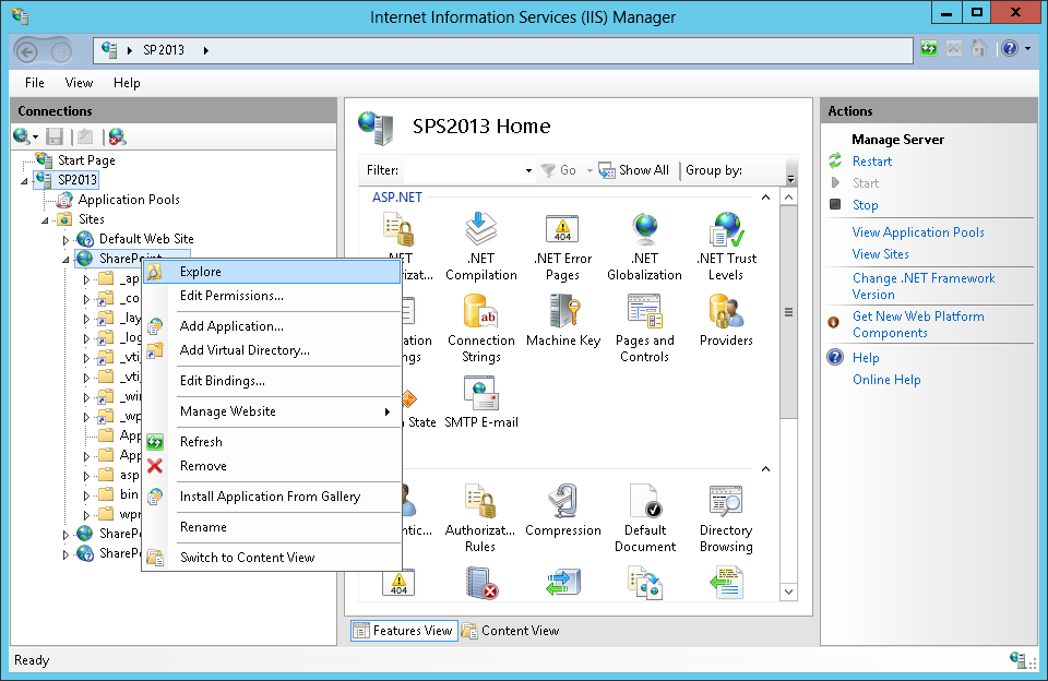
- On your server click Start, click Administrative Tools, and then Internet Information Services (IIS) Manager
- Right-click the IIS website where the SharePoint web application is installed, and then click Explore
- In Windows Explorer, double-click the App_Browsers folder
- Open the compat.browser file in a text editor
- Find the node that corresponds to the mobile browser or device that you want to modify
- Find the element
- Set the value attribute to false to display a standard view of the site in the mobile browser
- Save your changes to the compat.browser file
- Restart IIS by entering the following command at the command prompt
iisreset /noforce
- After the restart open your SharePoint site in your mobile device

Option #3 - Create a device chanel
This method is only available for SharePoint publishing sites, it will work on Collaboration sites also but you need to activate first the Publishing features. Since it's only available for publishing it will not work on SharePoint Foundation.
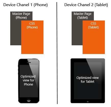
A device channel is a feature that enables you to render specific site content while maintaining the same URL across a pool of different devices, with it you can have different layouts for the same URL and SharePoint will manage them based on the user agent of the browser.
To Create a new device channel do the following:
- On your SharePoint site go to the site settings
- Open Device Channels, it is located under Look and Feel
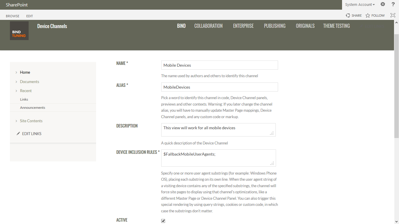
- Add a new item to the list. When you create a device channel item, there are five required and optional fields to supply for the process the table below lists these fields and describes what type of information must be provided.
- For all mobile devices fill the Device inclusion rules with:
$FallbackMobileUserAgents;
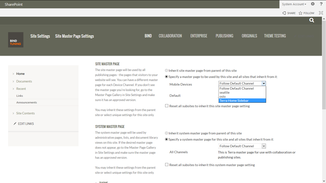
- Go to the site Settings and open Mater Pages, it is located under Look and Feel
- Set your desired master page to show on mobile devices
| Field | Required Value | Value |
| Name | Yes | This is the name of your design channel. It can be a friendly name to identify the channel |
| Alias | Yes | The alias name enables you to identify your device channel in code, device channel panels (discussed later in this article), previews, and other contexts |
| Description | No | A field for supplying a general description for the device channel |
| Device inclusion rules | Yes | A field for supplying the user agent substring such as Windows Phone OS. Device redirection to a specific master page depends on what is entered for this value. For more information about what values to supply in this field, see the table with the User agent substrings. |
| Active | No | Selecting this check box activates your device channel. |
| Device | User Agent Substring |
| Windows Phone 7.5 | Windows Phone OS 7.5 |
| Windows Phone | Windows Phone OS |
| iPhone | iPhone |
| iPad | iPad |
| Any Mobile Device | $FallbackMobileUserAgents; |
| Default | Default |